Prom is over. We know who was crowned Prom King and Queen – Logan Rowan and Jocelyn Tienda. But how did they do in the promotional lead up to the voting? Did their hallway fliers work? Were their pictures engaging? Funny? Cute? Did the fliers get students to vote for them or were they going to vote for them anyway? Was Logan’s huge poster on the door of the library what gave him the victory?
Our photo journalists scanned the building to check out the fliers and here are their thoughts:
Elaina and Jaxen
“I liked the front and the color blue. The picture they chose is cute and works. It was also in a nice location on the stairs and by the stairs. Four of them are located pretty close together. That was a nice strategy.” – Brea Bogar
“Good theme that why chose (The Minions) but it didn’t have much information, the size is good because you can see it from afar.” – Angelina Chaires
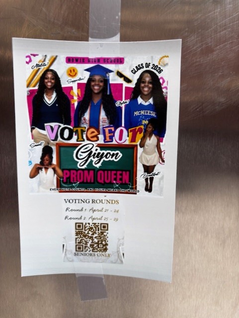
Giyon
“Love it. Well decorated, the color palette and all the information is there but the spot was between the lockers and the size was small.” – Angelina Chaires
“Enough information to make a decision. Liked having a QR code, although the whole thing was a little too small.” – Thu Tran
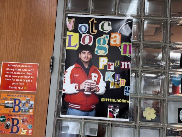
Logan
“Liked the picture he chose. He looks good in it. My only negative is that the flier doesn’t provide information . . . although it does drive people to his Instagram. That was smart.” – Angelina Chaires
“Good picture. Good poster. Simple theme.” – Thu Tran
“Nice sized poster. Like the fact that he put in his social media. The one I saw was by the stairs and in a busy part of the hallway. Good choice.” – Brea Bogar
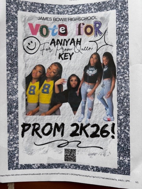
Aniyah
“Cute poster with simple stickers. Could have had better pictures, though.” – Thu Tran
“Information was easy to read but for this flier, at least, not a great spot.” – Arelis Rodriguez
“Having different pictures of her helps. She also had multiple posters in some good locations with lots of traffic. I love the font style. QR code was a nice tough, too, which tells you where and how to vote.” – Bra Bogar
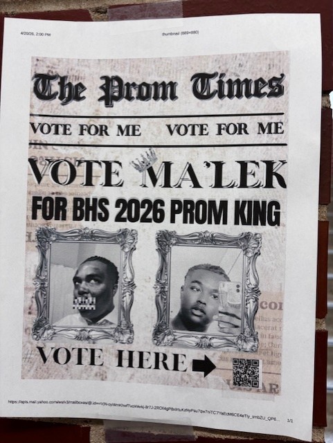
Ma’lek
“This flier was in a nice location where people can see it. But . . . kind of looks like a wanted poster.” – Brea Bogar
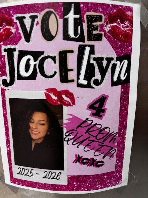
Jocelyn
“Cute and pink design. Very eye-catching. All evenly spread out, too.” – Brea Bogar
“Information wasn’t given but the spot was in a nice location to find it.” – Arelis Rodriguez
“I love the colors that she used for the poster but it doesn’t provide good information or anything. Just her name. Who are you?” – Angelina Chaires